Adventure
Brand identity to help buyers find their way home.
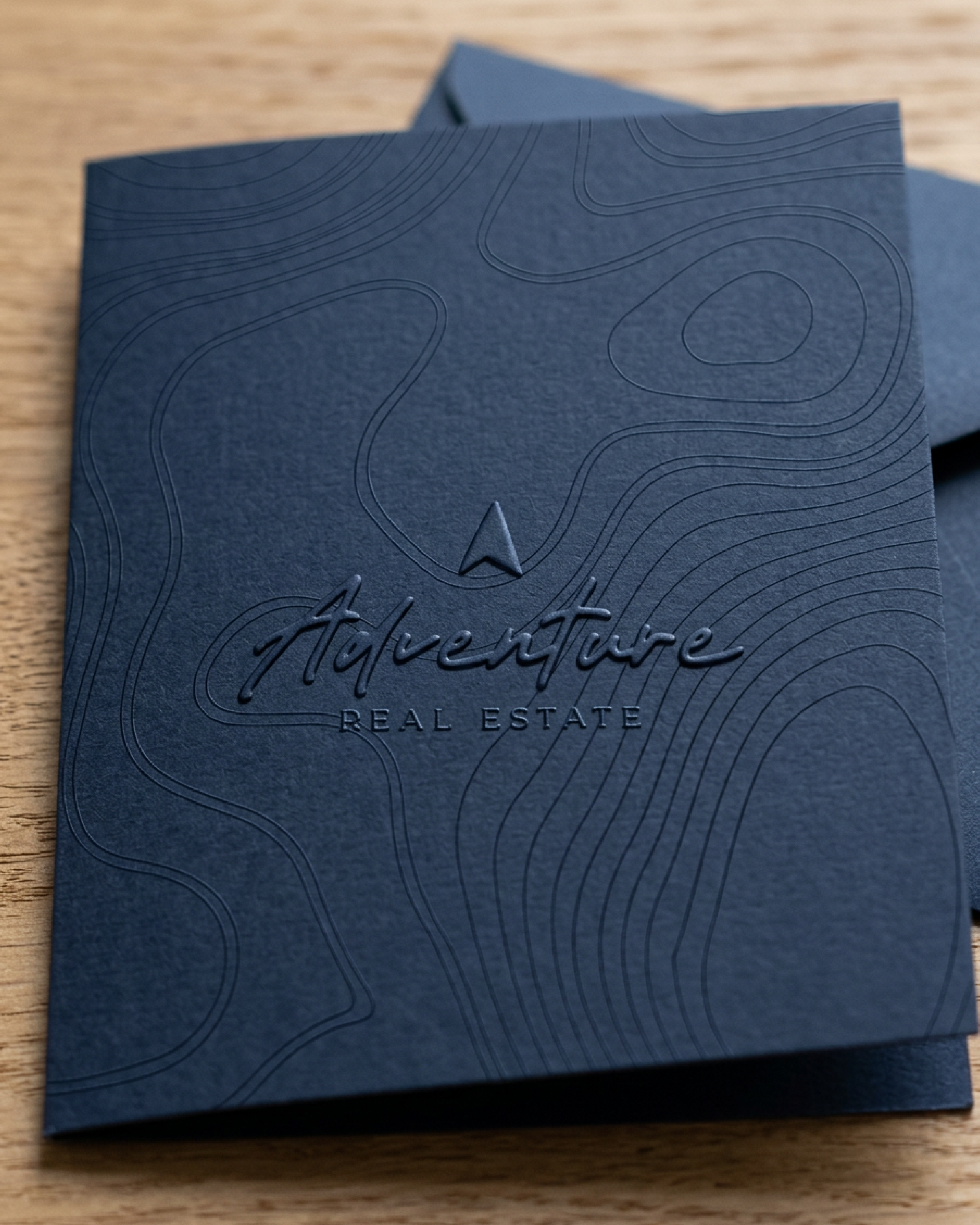
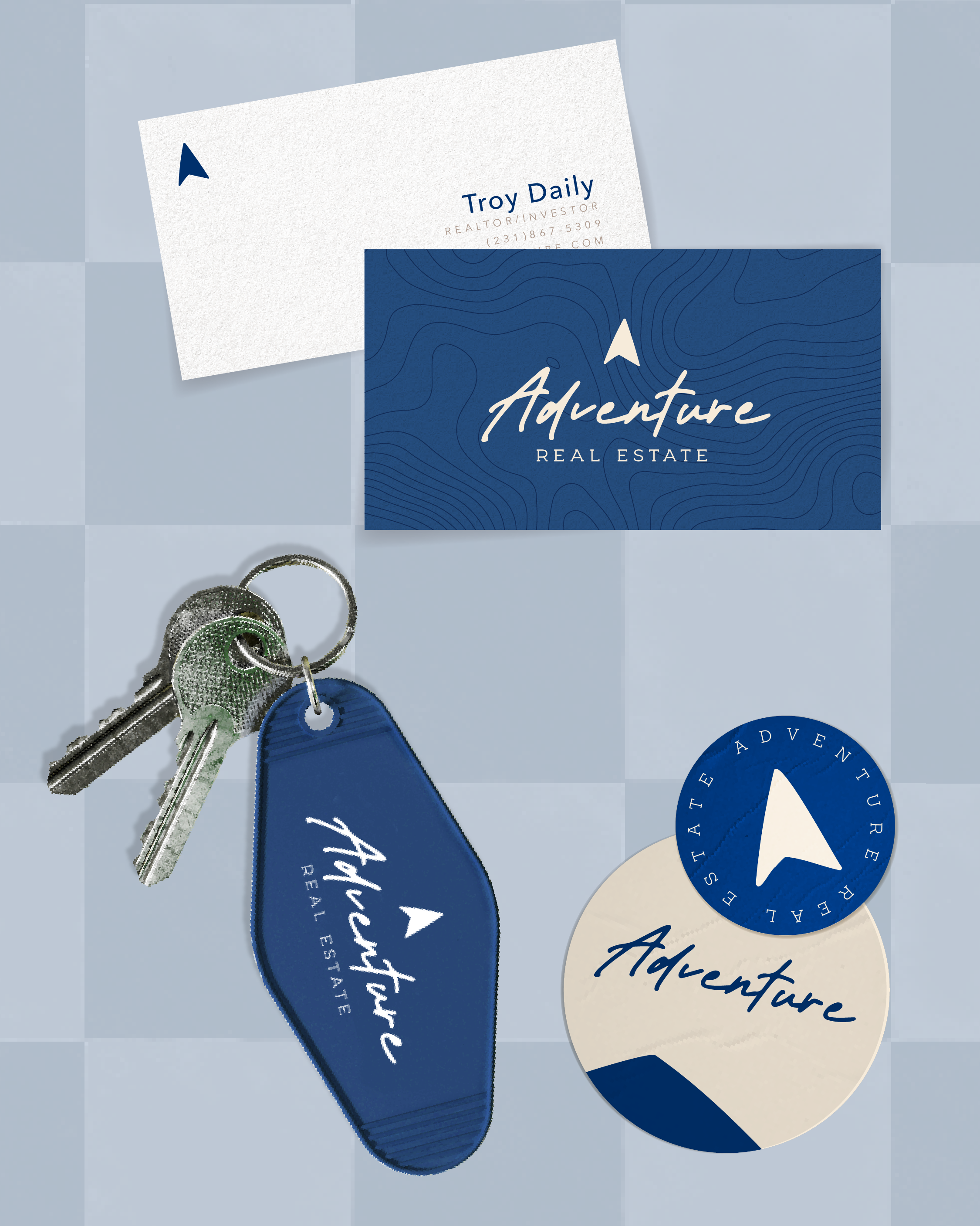
Inspired by its Northern Michigan roots, the Adventure Real Estate mark combines a north-pointing arrow with the familiar shape of a roofline. The arrow represents guidance, pointing buyers toward the places, properties, and possibilities that feel like home, while the roof subtly anchors the mark in what they’re ultimately searching for.